



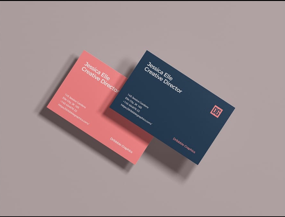
There’s a specific moment that happens when someone taps a digital business card for the first time — a brief pause while the profile loads, followed by whatever impression that page happens to make. In that short window, a card either reinforces the sense that you’re someone worth taking seriously, or it quietly undercuts it with a blurry photo, a half-written bio, or a layout that feels rushed. The difference between the two usually isn’t about having access to better tools or a bigger budget. It’s about a handful of deliberate choices that most people simply haven’t thought through yet.
If you already have a digital business card set up and you’re wondering why it doesn’t quite feel as polished as you’d like, or you’re building one for the first time and want to get it right from the start, this guide walks through exactly what separates a professional-feeling card from one that feels unfinished.
Professionalism Is Mostly About Removing Small Inconsistencies
Before getting into specific fixes, it helps to reframe what “professional” actually means in this context. It rarely comes down to one dramatic design choice. More often, it’s the absence of small inconsistencies — a photo that doesn’t quite match the tone of the rest of the page, a broken link, a bio that reads like it was copied from somewhere else. Each of these on their own might seem minor, but together they create a subtle sense that the page wasn’t given much thought, even if the underlying information is accurate.
The good news is that fixing this doesn’t require redesigning everything from scratch. It usually means going through your existing card with a slightly more critical eye and cleaning up the details that are quietly working against you.
Start With a Photo That Actually Represents You Well
Your photo carries more weight than almost any other single element on the page, simply because it’s the first thing anyone actually looks at. A photo that’s outdated, poorly lit, awkwardly cropped from a group shot, or simply low resolution undercuts the rest of the profile before anyone has read a single word.
You don’t need professional photography for this. What matters more is that the photo is recent, clearly shows your face, and is taken against a simple, uncluttered background. A slightly casual photo taken with good natural lighting will almost always look more professional than an old, low-quality image, regardless of how formal the original setting was.
Rewrite Your Bio So It Sounds Like an Introduction, Not a Job Listing
A surprisingly large number of digital business cards either skip the bio section entirely or fill it with something that reads like a line pulled directly from a job posting — dense, formal, and strangely impersonal. Neither approach tends to feel professional in practice. An empty bio makes the page feel incomplete, while an overly stiff one can come across as generic.
What tends to work best is something closer to how you’d actually introduce yourself to a new client or contact in person — a sentence or two describing what you do and who you help, written in your own voice rather than borrowed corporate language. This small shift alone often does more to make a card feel considered than any visual adjustment.
Keep the Layout Deliberately Simple
Most platforms give you the option to add quite a lot to your profile — multiple sections, several links, embedded documents, testimonials, and more. Using all of these options at once, however, tends to work against professionalism rather than for it. A page that tries to include everything ends up feeling cluttered, and clutter reads as disorganized, even when every individual piece of content is reasonable on its own.
A more professional approach is usually to include only what’s genuinely useful — your name, role, a short bio, a small number of relevant links, and perhaps one clear call to action. Leaving out extra sections that don’t add real value tends to make the page feel more intentional, not less complete.
Match Your Card to Your Existing Brand, Carefully
If your business has an established visual identity — specific colors, a logo, a particular tone — carrying that into your digital card helps it feel like a natural extension of everything else you put out, rather than something built separately with default settings. This is often as simple as using your brand color as an accent on a button or header, and placing your logo clearly near the top of the page.
That said, it’s worth being careful not to overdo this. A profile with a heavily patterned background or an oversized logo dominating the page can end up feeling more like a promotional flyer than a professional introduction. The safest approach is generally a clean, mostly neutral layout with your branding used as a subtle accent rather than the main visual focus.
Verify Every Link and Button Actually Works
This is one of the simplest checks to make and one of the most commonly skipped. A broken link, an outdated contact number, or a booking button that leads to a dead page instantly undoes whatever polish the rest of the card has. Before considering your profile finished, it’s worth going through it yourself as if you were a stranger encountering it for the first time — clicking every link, testing every button, and confirming that your contact details are current.
It’s also worth repeating this check any time you make an update elsewhere. It’s common to update a job title and forget that an old portfolio link is still pointing somewhere outdated, and these small inconsistencies are often what quietly make an otherwise solid profile feel neglected.
Review It on Mobile, Not Just While You’re Editing It
Most people build their profile on a laptop or desktop screen, but the vast majority of people who actually view your card will be doing so on a phone. A layout that looks fine on a wide screen can end up cramped, awkwardly spaced, or slow to load once viewed on mobile. Taking a minute to tap your own card, or open your profile link directly on your phone, and scrolling through it the way a stranger would, is one of the easiest ways to catch small issues before they affect a real first impression.
Comparing a Few Common Issues Against Their Fixes
It can help to see some of the most common professionalism issues side by side with what actually resolves them, rather than treating each one as an abstract idea.
|
Common Issue |
Why It Undercuts Professionalism |
Simple Fix |
|
Outdated or blurry photo |
First visual impression feels careless |
Replace with a recent, well-lit photo |
|
Generic or missing bio |
Page feels impersonal or incomplete |
Write a short, natural introduction in your own voice |
|
Too many links or sections |
Page feels cluttered and unfocused |
Keep only two or three genuinely relevant links |
|
Broken links or old contact info |
Undermines trust immediately |
Test every link and button before considering it finished |
|
Inconsistent branding |
Feels disconnected from your website or company |
Use brand colors and logo consistently, but sparingly |
|
Poor mobile layout |
Most people view cards on their phone |
Check your own profile on a mobile device before sharing it |
Looking at these together makes it clear that most professionalism issues aren’t really about a lack of design skill — they’re about small oversights that are easy to fix once you know to look for them.
Keep the Content Current, Not Just Polished
A profile that looks great on the day it’s built can quietly become unprofessional over time if it isn’t maintained. An old job title, a portfolio piece that no longer reflects your best work, or a bio describing a role you no longer hold all send a subtle signal that the card isn’t being kept up. Since digital cards are far easier to update than printed ones, it’s worth setting a habit of reviewing your profile every few months, or whenever something in your role changes, rather than assuming it will stay accurate indefinitely on its own.
Don’t Confuse Minimal With Incomplete
There’s sometimes a hesitation to keep a profile simple, out of a worry that it will look unfinished compared to a more elaborate one. In practice, a clean, well-organized card with just a handful of carefully chosen elements almost always reads as more professional than a busy one crammed with extra sections and links. The goal isn’t to use every feature a platform offers — it’s to include exactly what’s useful, presented clearly, with nothing extraneous competing for attention.
Consider How the Card Fits Into a Larger First Impression
It’s worth remembering that your digital business card usually isn’t the only thing shaping someone’s impression of you — it sits alongside your actual conversation, your email signature, your website, and anything else they encounter from your business. A professional-feeling card works best when it reinforces the same tone and quality that shows up everywhere else, rather than existing as an isolated, disconnected piece. If your card feels noticeably more (or less) polished than the rest of how you present yourself professionally, that gap is often what people notice, even if they can’t quite articulate why something feels slightly off.
Choosing a Platform That Actually Supports This
Some of these fixes depend partly on the platform you’re using. A provider with limited customization options can make it harder to apply consistent branding or a clean layout, no matter how carefully you try. If you’re building or rebuilding your card with professionalism specifically in mind, it’s worth using a platform flexible enough to support these details properly, rather than working around a rigid template. A well-built Digital Business Card platform, such as the one available at evrycard , gives you enough control over layout, branding, and content to apply these adjustments without fighting against the tool itself.
A Simple Way to Audit Your Own Card Right Now
If you already have a card set up, one of the most useful things you can do after reading this is a short, honest audit of your existing profile. Open it the way a stranger would — ideally on your phone — and go through it slowly. Ask yourself whether your photo looks current, whether your bio actually sounds like you, whether every link works, and whether the page feels intentional or just assembled quickly. Most people find at least one or two small things worth fixing during this kind of review, and addressing them usually takes only a few minutes once identified.
Frequently Asked Questions
Do I need design experience to make my card look professional?
Not really. Most of what makes a card feel professional comes down to a handful of straightforward choices — a good photo, a natural bio, a clean layout, and working links — rather than advanced design skill.
What’s the single most impactful change I can make?
For most people, updating or replacing their profile photo has the biggest immediate impact, simply because it’s the first thing anyone sees.
Is it better to include more information, or keep the card minimal?
Generally, keeping it focused on a few genuinely useful elements reads as more professional than trying to include everything the platform allows. Clutter tends to undercut polish, not add to it.
How often should I review my card for professionalism issues?
Every few months is a reasonable habit, along with any time something in your role or contact details changes, since outdated information is one of the quickest ways a card starts to feel neglected.
Should my digital card match my company’s branding exactly?
It should feel consistent with it, though not necessarily identical. Using your brand colors and logo as accents, while keeping the overall design clean, usually works better than trying to replicate every branding element.
Final Thoughts
Making your digital business card more professional rarely requires a dramatic overhaul. It’s mostly a matter of paying attention to the small details that quietly shape how a page feels — a current photo, a natural bio, a clean and focused layout, working links, and content that’s actually kept up to date. Taken together, these details are what separate a card that feels genuinely considered from one that simply exists, and getting them right is well within reach for anyone willing to spend a few minutes reviewing what they already have.
